
For a bare-metal server you see the traffic on its switch port: what it's doing right now, its average and peak, its 95th percentile and the total moved in and out over the period. A cloud instance gives you the hypervisor's view instead, meaning CPU, memory, network and disk activity over time. You'll find both in the portal and in the API. Below is where to look, and how to read what you find.
Two units get mixed up all the time:
- Rates are in bits per second (Mbps, Gbps). At most, a 10 Gbps port moves 10 gigabits a second, which works out to 1.25 gigabytes.
- Totals are in bytes (GB, TB), the same unit your plan is written in. Only outbound transfer counts on a metered plan, and inbound is free. For how metered and unmetered plans work, see bandwidth explained.
Method 1: In the portal
Bare-metal servers: the Graphs tab
- Log in at amoni.app, open Servers, click the server, then the Graphs tab.
- When the server has several connected ports, choose the one you want with the buttons at the top right. Under the heading, a single line tells you the port's name, its type, the link speed and whether it's up.
- Up top, three live tiles show Link speed, Inbound and Outbound, as of the last poll.
- The table breaks the selected period down by direction: Now, Avg, Max, 95th % (all rates), plus Total (bytes moved). The note underneath says when statistics started for this port. If collection only began recently, it covers less than the period you picked.
- The graph plots that same period. Use Day, Week, Month and Year at the bottom to switch, and the table changes with it.
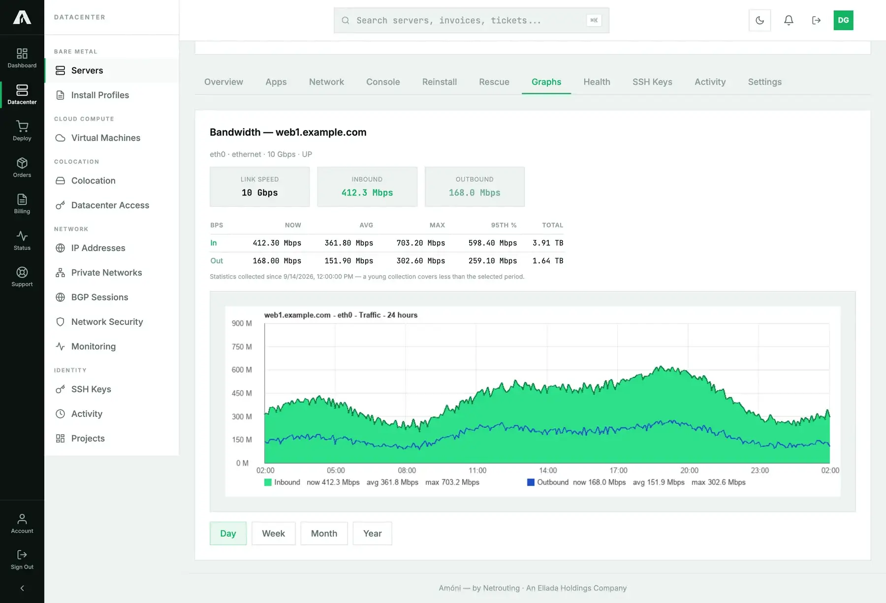
Reading the 95th percentile. Take every five-minute sample in the period, sort them and throw away the top 5%. Whatever sample is now highest is the 95th percentile. It shows sustained load and ignores short bursts. When you're deciding whether to upgrade, this is the number to hold up against the port speed. A 95th percentile near the link speed means the port really is saturated and isn't just spiking.
Cloud instances: the Insights tab
- Go to Virtual Machines, click the instance and open Insights.
- Choose a window: Hour, Day, Week, Month or Year.
- You get four charts on one shared clock: CPU (percent of the allocated cores), Memory (used, against the allocation in the title), Network (in and out, bits per second) and Disk I/O (read and write, bytes per second).
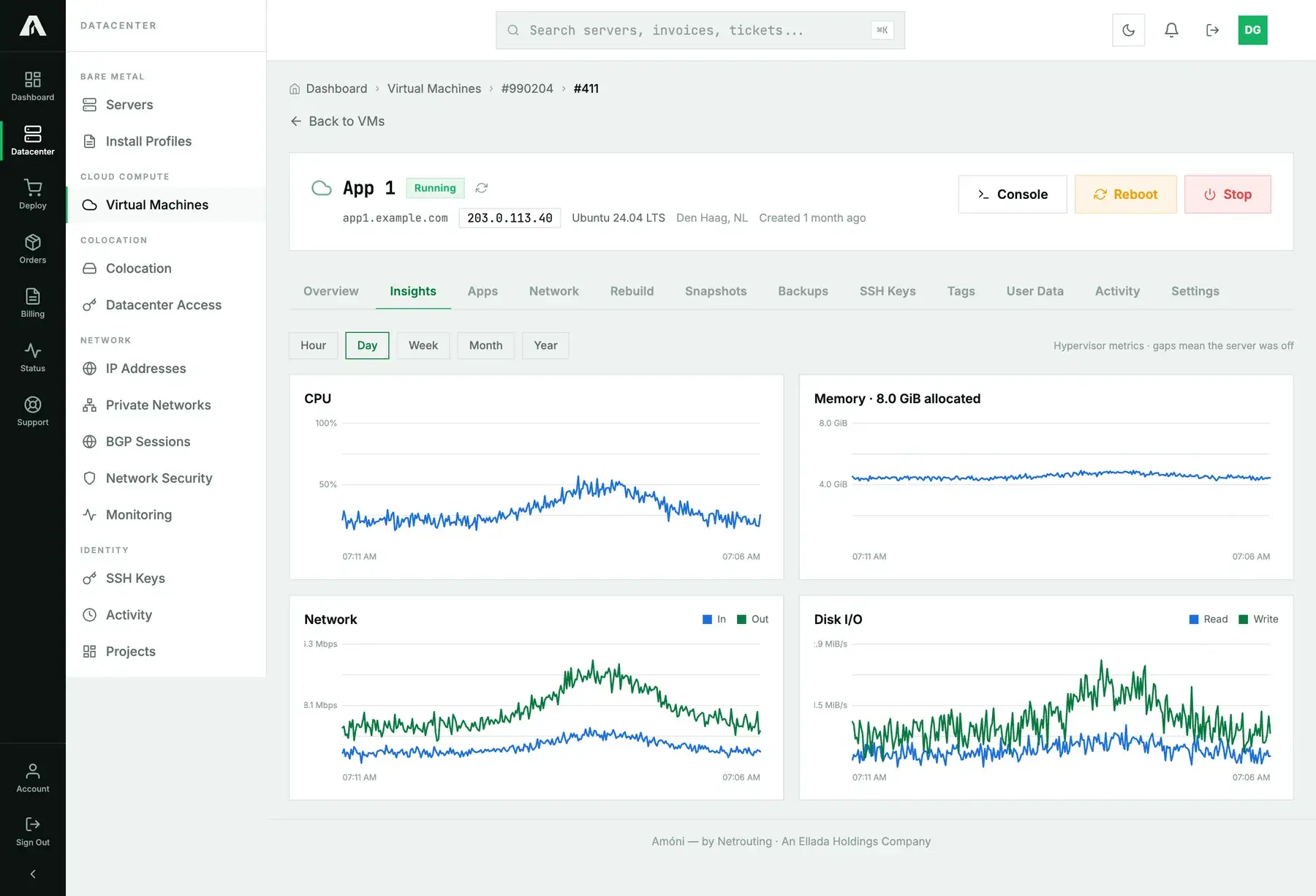
Because these come from the hypervisor, you don't install anything in the guest, and they're the same charts we'd check if you opened a ticket about performance. A gap in a line is time the instance spent powered off. A flat line at zero means it was on and doing nothing.
Method 2: With the API
A key with the read scope can fetch all of this. Full reference: api.amoni.app/v1/docs.
Bare metal
1. Find the port. Every connected interface has a port_id, and that's what the next two calls expect.
curl -s https://api.amoni.app/v1/servers/955/bandwidth -H "Authorization: Bearer nr_live_..."{ "success": true, "data": [ {
"id": 1, "interface_name": "eth0", "type": "ethernet", "speed": 10000, "status": "up",
"port_name": "Ethernet12", "port_id": 5011, "in_bps": 412300000, "out_bps": 168000000 } ] }2. Period statistics for the port. Set period to day (the default), week, month or year.
curl -s "https://api.amoni.app/v1/servers/955/bandwidth/stats?interface=5011&period=month" \
  -H "Authorization: Bearer nr_live_..."
{
"success": true,
"data": {
"period": "month",
"samples": 8640,
"covered_from": "2026-08-16 00:00:00",
"in_bps": { "now": 412300000, "avg": 361800000, "max": 703200000, "p95": 598400000 },
"out_bps": { "now": 168000000, "avg": 151900000, "max": 302600000, "p95": 259100000 },
"total_in_bytes": 117240000000000,
"total_out_bytes": 49200000000000
}
}Rates come in bits per second, totals in bytes. Check samples and covered_from to see how much of the period the numbers actually span. To check a metered plan's monthly egress in terabytes:
curl -s "https://api.amoni.app/v1/servers/955/bandwidth/stats?interface=5011&period=month" \
  -H "Authorization: Bearer nr_live_..." | jq '.data.total_out_bytes / 1e12'
3. The graph itself, returned as an image you can drop into your own dashboard:
curl -s "https://api.amoni.app/v1/servers/955/bandwidth/graph?interface=5011&period=week" \
  -H "Authorization: Bearer nr_live_..." -o web1-week.png
What comes back is the image itself (PNG or SVG, per the Content-Type). It isn't JSON.
Cloud instances
For now, Insights metrics live in the portal only. The public API doesn't expose them yet, though it's on the list. Once it does, the call will look like this:
curl -s "https://api.amoni.app/v1/vms/990204/411/insights?timeframe=day" \
  -H "Authorization: Bearer nr_live_..."
{ "success": true, "data": { "timeframe": "day", "points": [
{ "t": 1757900100, "cpu_pct": 23.4, "mem_bytes": 4563402752, "maxmem_bytes": 8589934592,
"net_in_bps": 21300000, "net_out_bps": 61800000, "disk_read_bps": 480000, "disk_write_bps": 1310000 },
{ "t": 1757900400, "cpu_pct": null, "mem_bytes": null, "maxmem_bytes": null,
"net_in_bps": null, "net_out_bps": null, "disk_read_bps": null, "disk_write_bps": null } ] } }timeframe is hour, day, week, month or year. A point full of null values marks a moment the instance was off, so don't read it as zero. Results are cached for a minute per instance and window.
What the API will tell you
| Status | Meaning |
|---|---|
| 200 | Data as shown above, or an image body for the graph. |
| 401 / 403 | The key is wrong, or it lacks read. |
| 404 | That server isn't on your account, or the port_id belongs to a different server ({"success": false, "error": "Server not found"}). |
| 422 | Unknown period, or interface missing, returned in the framework's shape: {"message": "The selected period is invalid.", "errors": {"period": ["…"]}}. |
200 with [] |
Interfaces: no port on this server is linked to monitoring yet. Open a ticket and we'll link it. |
Troubleshooting
- The Graphs tab says no graphable interface, or the graph area is empty. We haven't linked the server's port to our monitoring yet. Open a ticket with the server selected. Linking it takes minutes, and history starts from that point.
- The totals look too small for the period. Read the “statistics collected since” note (or
covered_fromin the API). If the port was linked two days ago, it can't show you a month. - My invoice says something else. Billing counts outbound bytes on the switch port across the calendar month, while Day, Week and Month here are rolling windows that end right now. Choose Month at the start of a new month and the two come close. They'll never match exactly.
- Inbound looks “wrong way round”. Inbound is traffic to your server (updates and files it fetches, uploads from users). Outbound is whatever your server sends (page views, files your users download). Expect a web server to be heavy on outbound.
- The 95th percentile is higher than the average by a lot. That's normal with bursty traffic. The average tells you total use. The 95th tells you how busy the port gets.
- Insights shows gaps. The instance was off for those minutes. When every chart has a gap at the same moment, that's a stop or a rebuild, and the Activity tab has the timestamps.
Still stuck?
Open a support ticket with the machine selected and tell us which period you're looking at. We read the same graphs you do, so a screenshot helps a lot.